Verloop.io WABA analytics furnishes you with an extensive overview of the price charged for various conversation types and the conversation volume data for different connected phone numbers. It helps you understand how much your messaging platform costs and how much you actually get out of it. You can also track the changes in your messaging costs over time and see which account is driving the most conversations.
How to View Analytics?
The following steps describe how clients can access their WABA account’s usage and analytics on the WABA dashboard:
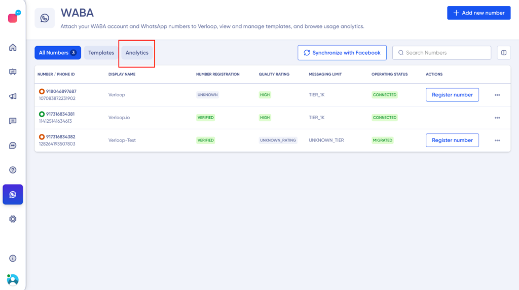
1. Click on WABA on the side panel of your Verloop.io platform.
2. Open the WABA dashboard and click on the “Analytics” tab, located next to “Numbers” and “Templates”.
3. Upon landing on the Analytics page, the default filters and graphs
Now that you can view the analytics dashboard, let’s get into the nitty gritty of what all you can view and customize as per your needs.
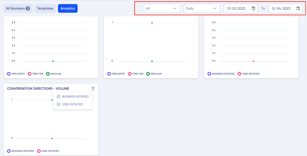
Graphs
The graphs are subdivided into types:
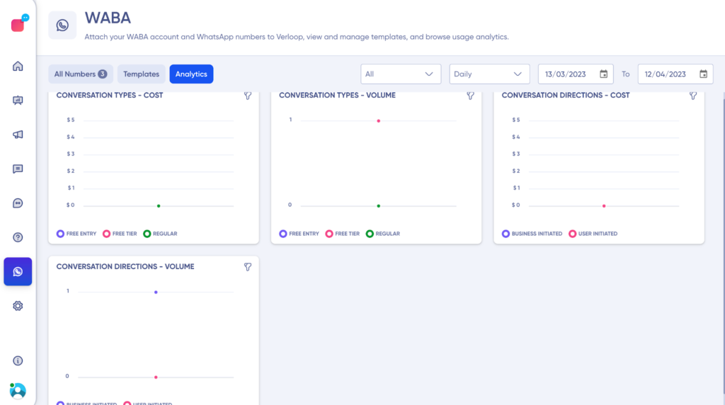
- Pricing: There are two graphs under this category, based on the cost charged.
- Conversation Types- Cost: To view the cost charged for different conversation types
- Conversation Direction- Cost: To view the cost charged per volume based on user or business-initiated conversation.
- Volume: There are two types of graphs under this category, based on conversation volume
- Conversation Types – Volume: This graph would show conversation volume based on the type.
- Conversation Direction – Volume: This graph will show conversation volume for the user and business-initiated conversation.
Now, let’s understand the different graphs and what custom filters you can apply to them.
Conversation Types – Cost
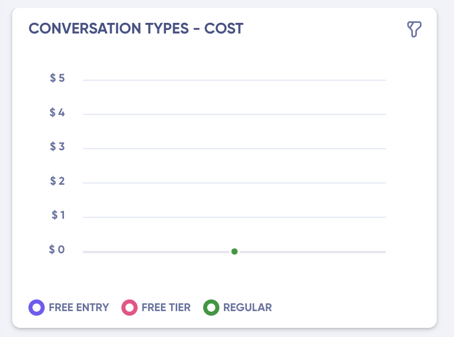
As already mentioned above, you can view the cost charged to you for different conversation types as described by META.
Here:
- X-axis shows the time
- The y axis shows the price charged
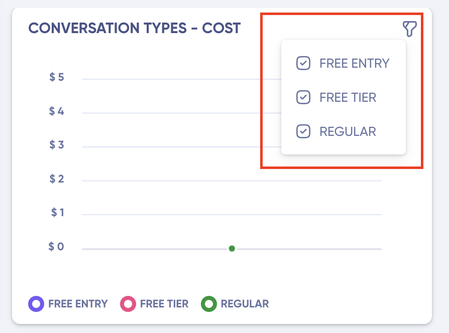
You can also view the cost of a specific conversation type by clicking on the graph filter, present on the graph’s right-above corner as shown below.
Conversation Types – Volume
As mentioned before, under this graph, you can see the number of conversations for a specific conversation type as defined by META.
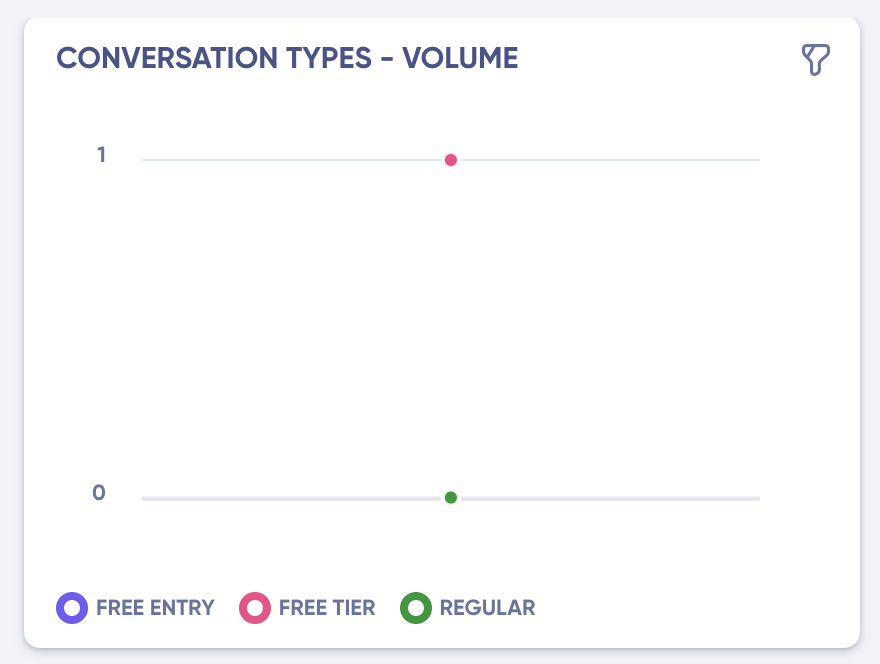
Here:
- X axis shows the time
- Y axis shows the number of calls
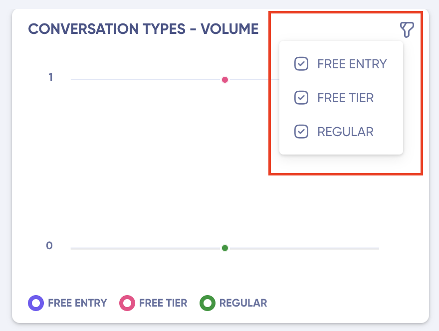
You can view the number of conversations of a specific conversation type by clicking on the graph filter, present on the graph’s right above corner as shown below.
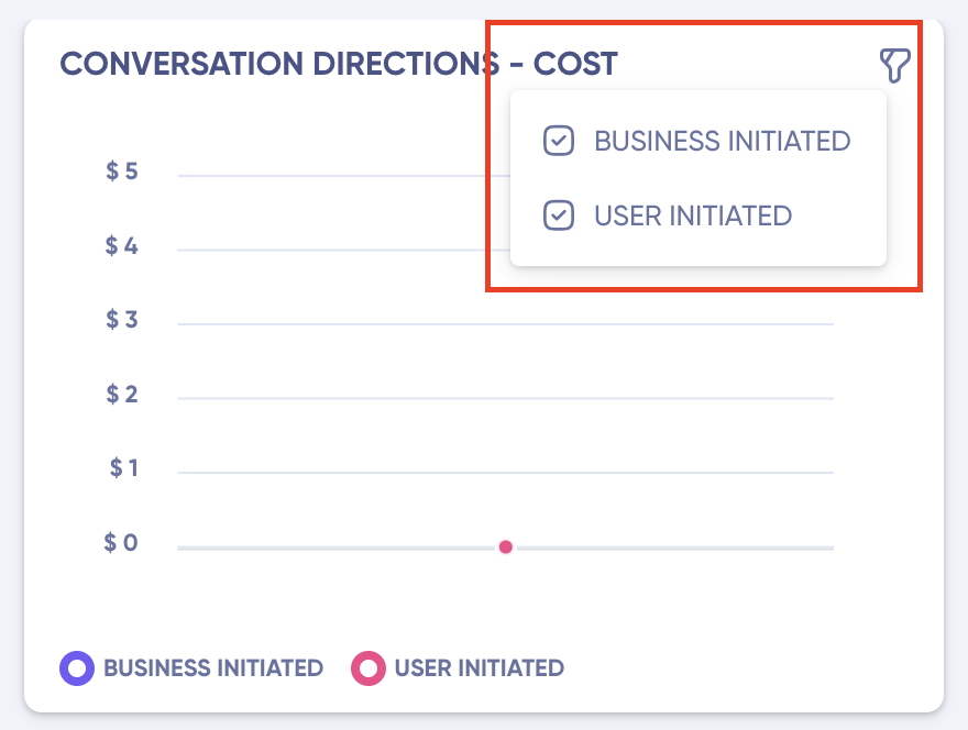
Conversation Directions – Cost
You can view the price charged in this graph for how the conversation was initiated, i.e., business initiated and user initiated.
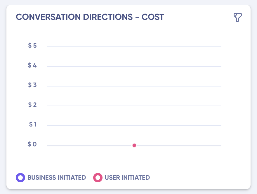
Here:
- X axis shows the time
- Y axis shows the price charged
You can also view the cost of a specific conversation flow by clicking on the graph filter, present on the graph’s right above corner as shown below.
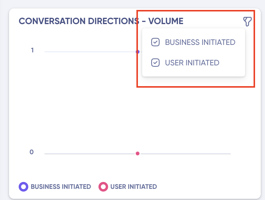
Conversation Directions – Volume
As mentioned before, under this graph, you can see the number of conversations for a specific conversation flow,i.e., number of conversations initiated by business and users.
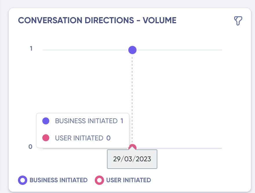
Here:
- X axis shows the time
- Y axis shows the number of conversations.
You can also view the number of conversations of a specific conversation flow by clicking on the graph filter, present on the graph’s right above corner as shown below.
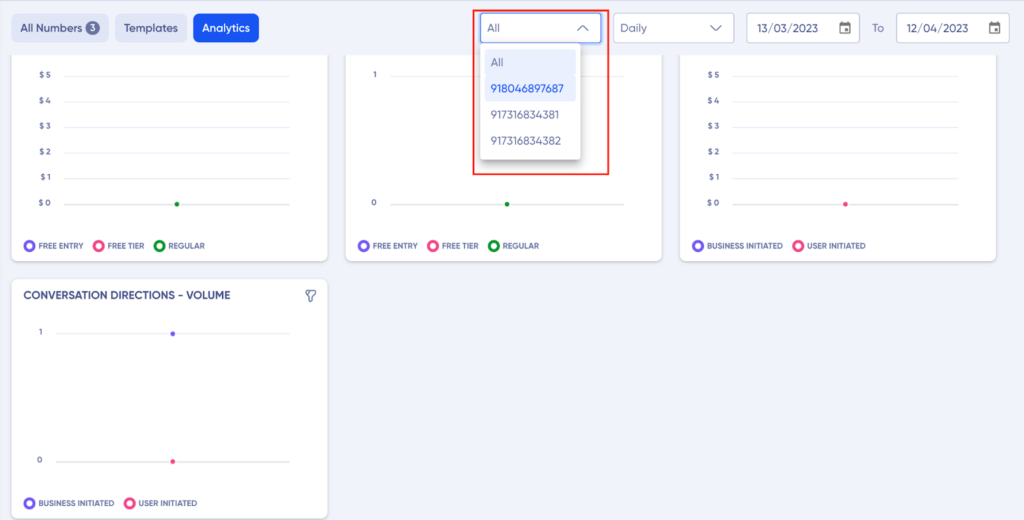
Filters
Graph specific filters for all analytics can be applied by clicking the filter on the graph. You can even apply universal filters, by selecting the required filter shown above all the graphs, as you can see below.
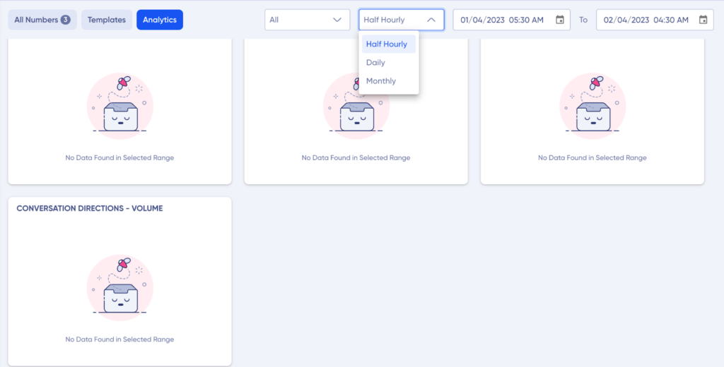
There are 3 types of filters available in the dashboard
- Phone Numbers
- Granularity of the Graph
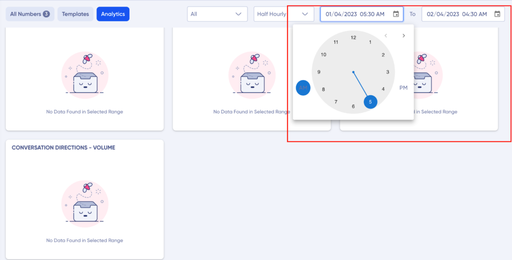
- Time Duration Filter
Let’s understand them in dept
Phone Numbers
Using this filter, you can filter out the number linked to the WABA account, to see data for a specific number.
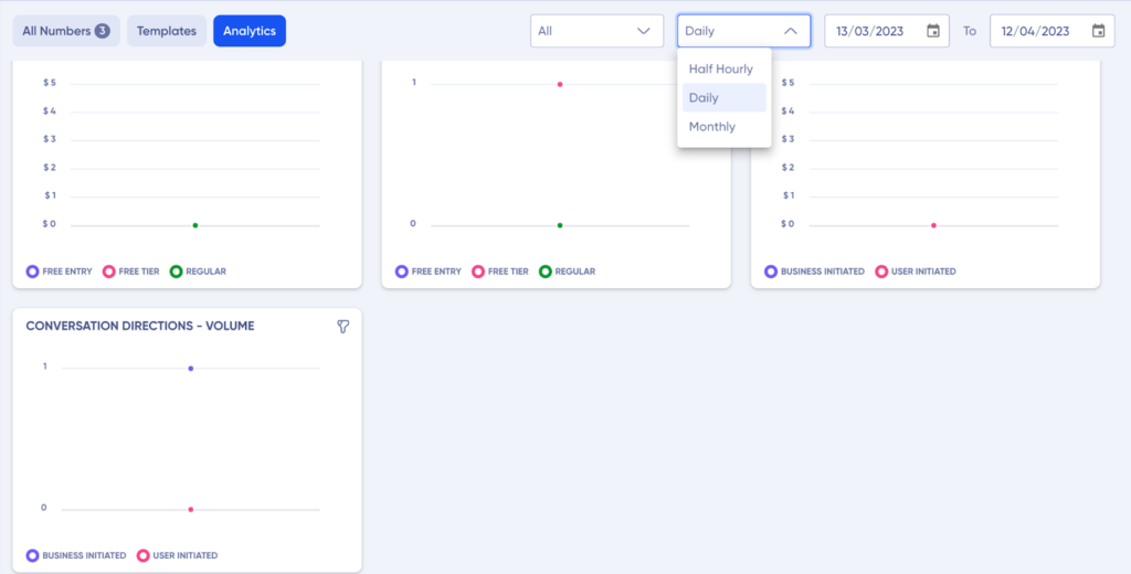
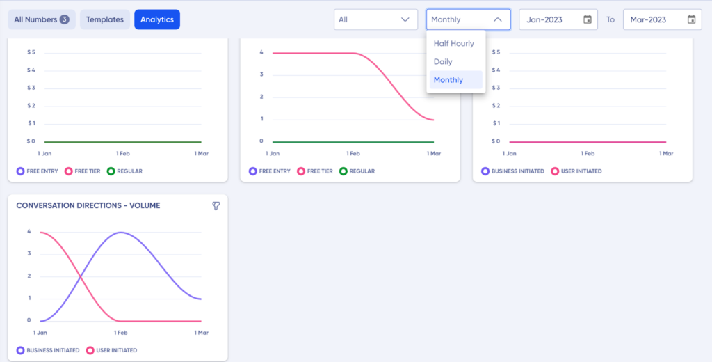
Granularity of the Graph
Here you can fix the granularity of the graph for based on how you want to view the data on x axis:
1. Half Hourly: The graph will split in to depict the data for the day on half hourly basis. Up to 1-day max span.
You can go the time duration filter here to even set the time for which you want to view the data.
2. Daily: Here your graph will spilt to show the data on day basis. Up to 1-month max span.
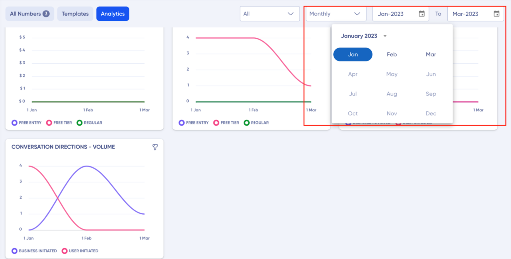
3. Monthly: Here you can split the graph to view the monthly data. Up to 1-year max span
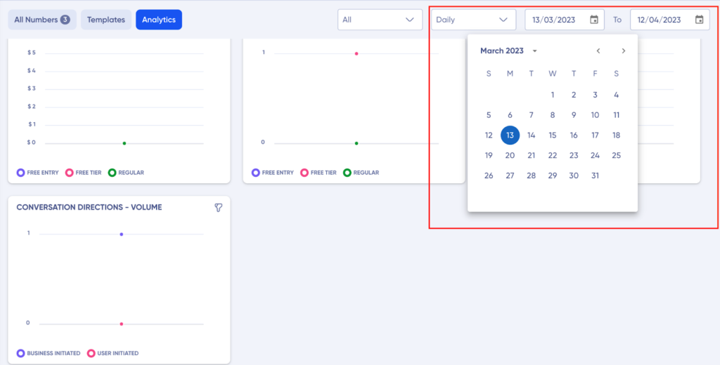
Time Duration of the Analytics
The last filter which you can use is change the time duration for which you want to view the data.
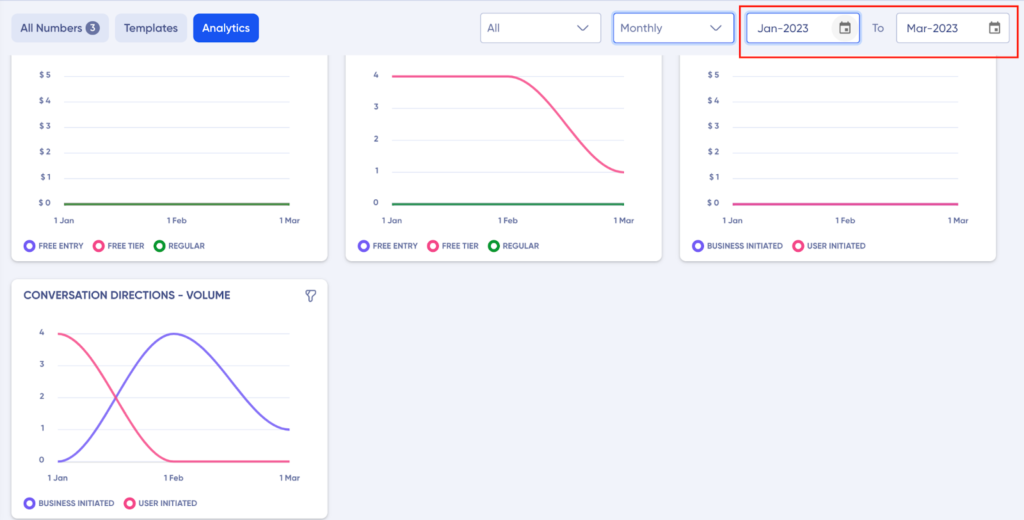
Based on the different time period of the graph you selected, this will automatically change and you can customize the date/time/month, accordingly.
Half Hourly

Daily
Monthly